I printed out two copies of my book to take to bookbinding to be on the safe side. I really enjoy book binding and I am really pleased with my final book, its so good to see it all come together. I choose and reddy, brown colour for the cover as I feel it complimented the colours within the content of the book and the paper. I used the same off white textured paper for the inside cover of the book as I wanted to keep it clean and simple. I really love the colour of the cover and I used a cream coloured thread for the binding.
I did make a second copy of the book, however I am less pleased with the quality of it compared to the first one. I did not cut the hardboard completely exact so one side is noticeably bigger than the other. It is also not as sturdy as I did not tighten the thread enough. I am still happy I have two copies though.
My first copy, entitled '100' will go in the exhibition. The second copy, entitled 'One Hundred' I will hand in with the rest of my work.
Tuesday, 31 January 2012
Exhibition Piece
I went to Digital Print first thing this morning to print my exhibition piece. I put together three versions and I have printed all of them out A2 size so I can see which one works best in layout and and presenting the illustration and text in the best way.

I have layed out this piece landscape as all of the illustrations in my book are landscape, however I am not keen on this version for the exhibition as I think the text is too big and the layout is not quite right. I feel it would be better portrait for the exhibition.

 I wanted to see what the text would look like on A2 tracing paper over the A2 image of Dorothy Custer. I really like this format in the book and think it works really well. However, the text over the image at A2 size I don't feel works as an exhibition piece as the text overpowers the image, taking away the character of the illustration I am trying to convey. I think it is a bit too busy.

I laid the three A2 images next to each other and asked people in the studio which version they preferred and they all said this one which I agree with. I feel that this layout with the text a smaller size below the illustration works really well for presenting in the exhibition. Out of the three I have tried this is the clearest and simplest layout A2 sized, the text does not take away from the image and vice versa. I think people will be intrigued to read the story from the illustration, which will then make the illustration and character of Dorothy more apparent. Her personality will unfold as they read the comical story and I think it will engage the audience.

I have layed out this piece landscape as all of the illustrations in my book are landscape, however I am not keen on this version for the exhibition as I think the text is too big and the layout is not quite right. I feel it would be better portrait for the exhibition.


I laid the three A2 images next to each other and asked people in the studio which version they preferred and they all said this one which I agree with. I feel that this layout with the text a smaller size below the illustration works really well for presenting in the exhibition. Out of the three I have tried this is the clearest and simplest layout A2 sized, the text does not take away from the image and vice versa. I think people will be intrigued to read the story from the illustration, which will then make the illustration and character of Dorothy more apparent. Her personality will unfold as they read the comical story and I think it will engage the audience.
Monday, 30 January 2012
Final Book
These are my final illustrations and type to accompany the 100 year old people I have been reading about. Each piece of text presents something of key importance that I have read about them or they have said in interviews. The quotes range from sentimental to comical and I feel represent their sincerity and character. I am pleased with my collection and and feel that is flows and has a focus.


I was thinking of formatting the book in Indesign, however, I have been experimenting and I feel that the text would look really effective if printed onto tracing paper, with the illustrations printed onto heavy weight off white paper, layering the text over the image. I think it will create exciting element to the book and subject within it, simple and adding to the handmade feel within the book with the hand painted type and watercolour illustrations printed on textured paper. The book will be 18 pages plus a title cover which I still need to do but I am unsure of the title. I want it to be really simple, something like '100' or 'Happy, Healthy, 100', I'm going to experiment with some hand painted type to see what works best.
I intend to then Japanese bind the book, I need to think about the colour of the cover and thread as they need to be in keeping with the colours and theme in the book. I have received positive feedback on this idea on how to bind the book, people were really enthusiastic about it in the Final Crit and I am eager to go and bind it on Monday!
I have inquired about printing onto tracing paper in Digital Print and there is some heavyweight tracing paper that can go through their printers. The only problem is that Digital Print is fully booked up, so I am going to get there very early to make sure I can print in the drop in.
Exhibition Piece
I still need to think about how I am going to lay out and format my exhibition piece, which is going to be an illustration of Dorothy Custer from her interview on Jay Leno. I want to include the story she told as a longer piece of text written in the same style as in the book, using blue ink and a paint brush. The story she told stood out to me as it is a comical tale and the way she tells it is so animated and her personality and character shine through in the interview. She is kooky and happy, I want to emphasize this in my illustration which I need to work on.
Wednesday, 25 January 2012
Thursday, 19 January 2012
Jaring Tinnerman; 100 year old swimmer
Jaring Tinnnerman, from Canada, was convinced to take up swimming by his wife when he was 80. Since then he has broken 4 world records and competes in swimming comptetitions. He swims three times a week and puts his good health and fitness down to four things;
- Genes
- Exercise
- Diet
- Spirit
In the year 200, in an interview he said 'I hope to be swimming when I am 100'. Which has now come true. He turned 100 in February 2009.
Interview with Jaring Tinnerman.
Interview with Jaring Tinnerman.
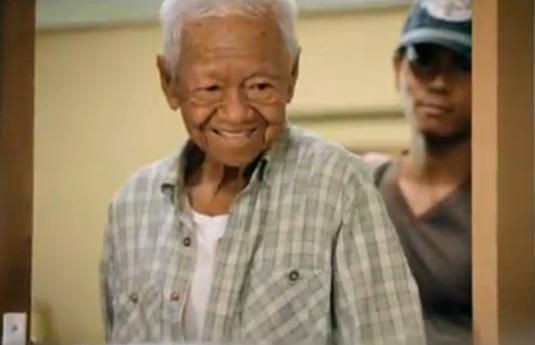
Jack Yaffe retires at 103


Born in 1909. He began working in the shop in Manchester 1934 and has just decided to retire at the age of 103. Above is a photograph of him and his wife Leah whom he opened up the shop with in 1934. He turned 100 in 2009.
Marion Deuchars
Matt recommended that I look at the hand drawn type work of Marion Deachar as I have began to create a lot of hand drawn type of my own. I really like the mix of small and large type she has used, emphasizing different words and sections of the text. I have began experimenting a bit more with my own hand drawn type using ink and a paint brush which I am really getting into.


Marion Deuchar's website.


Marion Deuchar's website.
Tuesday, 17 January 2012


Monday, 16 January 2012
Yes Dear

Herbert and Zelmyra Fisher are from America and hold the world record for their marriage of 85 years. Herbert, 104, and Zelmyra, 101, say the key to their long marriage is down to two words, Yes Dear.
Friday, 13 January 2012
Coca-Cola Advert; 100 year old man shares secret to happiness
Fauja Singh; 100 year old marathon runner


After the death of his wife and his son, Fauja Singh took up running as a way to keep happy, fit and healthy. I find this absolutely amazing, marathons are difficult for the younger generation!
Fauja Singh has now signed up for the 2012 Edinburgh marathon.
Video Of the Marathon and Interview
BBC News Article

Thursday, 12 January 2012
The direction I am headed
The article is a series of photographs of the women with them talking about their lives over the top. It follows them as the are celebrating their 100th birthday with their family and friends.


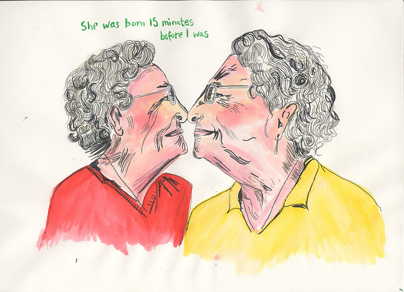
The two images above are my favourite photographs from the series and I am pleased with the overall image. I used water colour and pen, I wanted to use brighter colours than in the photo, not necessarily creating an exact replica of the photograph. I want to create interesting illustrations showing their character, not just copying the photograph. I have bought some better quality paper as the paper I used was not the best and the ink bleed a little.
I am less pleased with this image. I used some different pens and paper to experiment but I like the shades and colours better on the previous image.

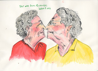
I got some new inks recently so I thought it was time to bring them out of their cases. This is a quick sketch using ink and water with a paintbrush. I really like the colours and aesthetic it creates. I also love this image of the twins.

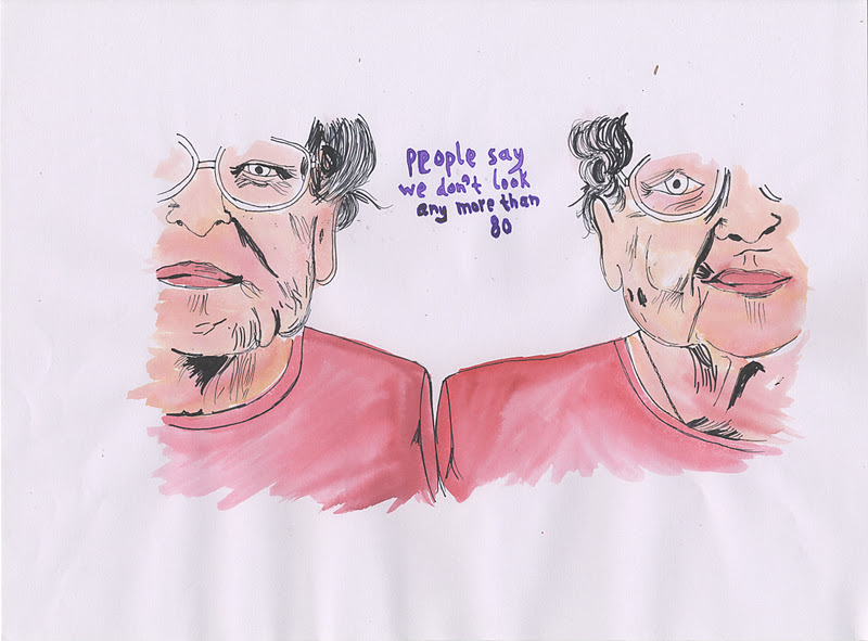
The two images above are my favourite photographs from the series and I am pleased with the overall image. I used water colour and pen, I wanted to use brighter colours than in the photo, not necessarily creating an exact replica of the photograph. I want to create interesting illustrations showing their character, not just copying the photograph. I have bought some better quality paper as the paper I used was not the best and the ink bleed a little.
I am less pleased with this image. I used some different pens and paper to experiment but I like the shades and colours better on the previous image.

I got some new inks recently so I thought it was time to bring them out of their cases. This is a quick sketch using ink and water with a paintbrush. I really like the colours and aesthetic it creates. I also love this image of the twins.
Tuesday, 10 January 2012
Sketchbook
Initially, I wrote a paragraph at the beginning of the book for people to read and respond to. A few prompts for them to write as much as little as they want to. I didn't get as many responses as I should have done, I found it quite lengthy to explain what I was doing. I could maybe have formatted the paragraph better and got people to write on separate postcards or something that made it clearer. This contributed to my struggle with trying to create a collection that related to each other and added to my frustration. I really like the responses I did receive.


I was really excited at the beginning of the project but I lost that in excitement when I got overwhelmed by the direction. I am glad that I spoke to people and got some responses. Even though I became frustrated with my work at this point, I feel it was a necessary process for me to go through to get to the point I am at now. Focusing on the other aspect I began exploring in my research about the 100 year old women and collecting more stories about 100 year old people. I feel excited again and I'm getting really into the subject.


Story from Sarah Reid.

Story from Anne Reid
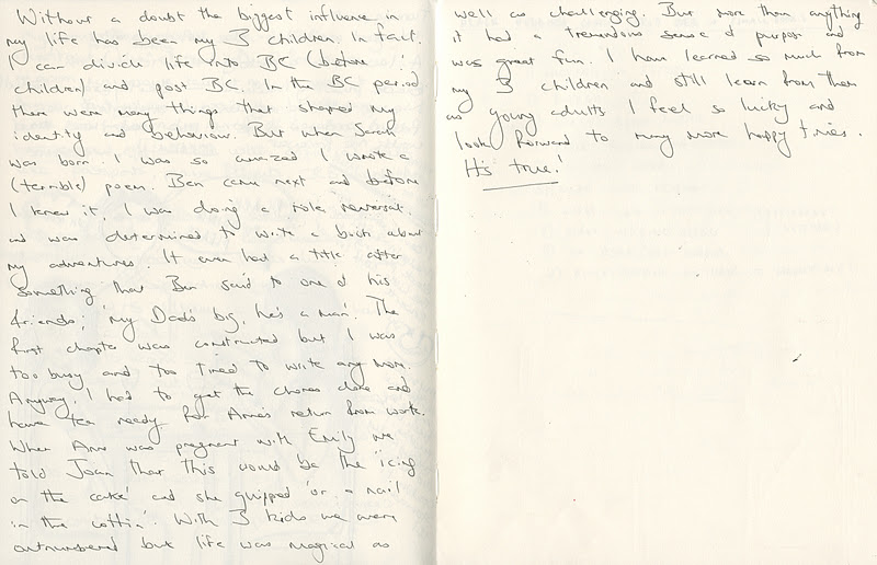
Story from George Reid

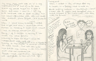
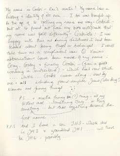
Story from Gabi Howells
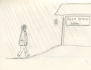
I started drawing and responding to my Mum's story about how much she hated black pudding because of the time she had to work in a black pudding factory. I was trying out paint and pen to see what worked but I do not like the work I produced.


I was really excited at the beginning of the project but I lost that in excitement when I got overwhelmed by the direction. I am glad that I spoke to people and got some responses. Even though I became frustrated with my work at this point, I feel it was a necessary process for me to go through to get to the point I am at now. Focusing on the other aspect I began exploring in my research about the 100 year old women and collecting more stories about 100 year old people. I feel excited again and I'm getting really into the subject.
Subscribe to:
Posts (Atom)