
Wednesday, 28 December 2011
Pia Bramley

Swim Series

The Barbican Conservatory

Hotel Breakfast

Family

It Is Winter

School Photo
Pia Bramley's blog
I really like Pia Bramley's style of illustration and the character she adds to the subject with her approach to the subject and drawing style. I like the simplicity of using watercolours and inks to emphasize personality and certain features.
Thursday, 22 December 2011
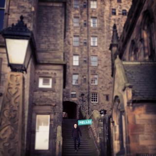
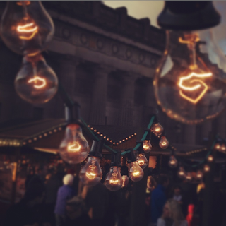
Bright.Bazaar
I really like these photos taken from a blog I follow Bright.Bazaar in Edinburgh, there are loads more on the blog...


Monday, 12 December 2011
100-year-old twins inseparable and best friends
Sisters celebrate 100 yrs of friendship, living together, doing everything together, and still dressing the same!
100-year-old twins inseparable and best friends
100-year-old twins inseparable and best friends
Screenprinting
Today I went to Vernon Street for the Four Colour Separation Screenprinting workshop. I have never tried this before and I haven't done as much screenprinting as I would like to do so I was really excited about the workshop! We had to bring in a full colour image on a memory stick so I brought a few options of images to print, I choose one of my brother and my Dad after deliberating.

The frames were already clean so one by one we took our images to the computer to print them out in the right format, four images CKMY, one image to be transferred to the screen for four different colours, Cyan, Black, Magenta and Yellow. Cyan and Black were transferred at the back of the screen and Yellow and Magenta at the front. Place frame onto vacuum, place coil on the side of the frame, clamp, vacuum, start. Once the transfer was complete I had to wash the screen thoroughly inside first and then outside. Holding up to the light to check if I had rinsed enough.


Whilst we were taking it in turns to print our images we mixed the colours together in plastic pots. Measurements, 50g of paint colour and 100g of binder. Mixing thoroughly to avoid streaks in the paint.
The first colour to print is Cyan. I put brown tape over the image directly next to the Cyan image and around the edge of it the prevent the paint from getting onto the other parts of the screen. Also had to put tape all around the edge of the screen to prevent the paint from going through. Sealing off all areas that the paint could get through. Using the squidy I test out the image on opaque paper to begin with, this is also for marking out where the paper will go so that every colour is printed on top of each other correctly and in line. I used thinner paper for some practice runs as I was slightly nervous and had to make sure the paint transferred through right and neatly. I then marked out where the good cartridge paper would be placed so that I printed in the same place every time. Marking out with masking tape on the printing machine.
I found at first I wasn't pressing hard enough on the squidy to transfer enough paint through, as I got into it after a few goes I began feeling more confident to press down harder and not be too cautious in that respect. Once I got into a rhythm of printing and knew what I was doing more I started really enjoying the process. I took my time and made sure I had done everything in the right order to prevent any mishaps.
Once I had printed the Cyan, rinsed the screen thoroughly and taken off the tape, I let the screen dry in the drying room and then moved onto the next colour, Yellow.


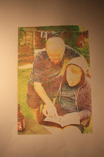

I am absolutely fascinated by this process and the image that is created from four key colours. I am really pleased with the image and am itching to go back and explore it more! I really want to use the printroom more as I haven't used them as much as I would have liked too and there is so much to do!


The frames were already clean so one by one we took our images to the computer to print them out in the right format, four images CKMY, one image to be transferred to the screen for four different colours, Cyan, Black, Magenta and Yellow. Cyan and Black were transferred at the back of the screen and Yellow and Magenta at the front. Place frame onto vacuum, place coil on the side of the frame, clamp, vacuum, start. Once the transfer was complete I had to wash the screen thoroughly inside first and then outside. Holding up to the light to check if I had rinsed enough.

Screen drying.

Whilst we were taking it in turns to print our images we mixed the colours together in plastic pots. Measurements, 50g of paint colour and 100g of binder. Mixing thoroughly to avoid streaks in the paint.
The first colour to print is Cyan. I put brown tape over the image directly next to the Cyan image and around the edge of it the prevent the paint from getting onto the other parts of the screen. Also had to put tape all around the edge of the screen to prevent the paint from going through. Sealing off all areas that the paint could get through. Using the squidy I test out the image on opaque paper to begin with, this is also for marking out where the paper will go so that every colour is printed on top of each other correctly and in line. I used thinner paper for some practice runs as I was slightly nervous and had to make sure the paint transferred through right and neatly. I then marked out where the good cartridge paper would be placed so that I printed in the same place every time. Marking out with masking tape on the printing machine.
I found at first I wasn't pressing hard enough on the squidy to transfer enough paint through, as I got into it after a few goes I began feeling more confident to press down harder and not be too cautious in that respect. Once I got into a rhythm of printing and knew what I was doing more I started really enjoying the process. I took my time and made sure I had done everything in the right order to prevent any mishaps.
Once I had printed the Cyan, rinsed the screen thoroughly and taken off the tape, I let the screen dry in the drying room and then moved onto the next colour, Yellow.
Cyan

Yellow

Magenta

Black

I am absolutely fascinated by this process and the image that is created from four key colours. I am really pleased with the image and am itching to go back and explore it more! I really want to use the printroom more as I haven't used them as much as I would have liked too and there is so much to do!

The final image on Cartridge paper 300 grams.
Friday, 9 December 2011
Visual Language; Collections, Collecting, Collectors Rationale
Tutorial with Matt 08/12/11
The tutorial really helped propel my ideas and get me thinking about what I need to look at and research. We had quite an open discussion to begin with and shared ideas, it was interesting to hear what everyone else was thinking of doing for the brief and get their feedback of my own idea.
I am interested in peoples history, why they are where they are, do the things they do, are with the people they are with etc. What were the events leading up to the life you lead today? My idea for Visual Language is to explore significant moments, collect interesting stories that have had a significant impact on someones lives or to them personally or has affected the way they think and the life they lead today. I want to use this information as a starting point to create imagery to accompany and present these moments to an audience in a way that engages them. I want to images and stories to have meaning and importance. I want the image to be true to the story and emphasize the moment and its significance to create a book.
Questions to ask myself;
To do;
The tutorial really helped propel my ideas and get me thinking about what I need to look at and research. We had quite an open discussion to begin with and shared ideas, it was interesting to hear what everyone else was thinking of doing for the brief and get their feedback of my own idea.
I am interested in peoples history, why they are where they are, do the things they do, are with the people they are with etc. What were the events leading up to the life you lead today? My idea for Visual Language is to explore significant moments, collect interesting stories that have had a significant impact on someones lives or to them personally or has affected the way they think and the life they lead today. I want to use this information as a starting point to create imagery to accompany and present these moments to an audience in a way that engages them. I want to images and stories to have meaning and importance. I want the image to be true to the story and emphasize the moment and its significance to create a book.
Questions to ask myself;
- What makes them want to read them?
- What impact will the images and stories have on the audience?
- How can I interpret stories to present and engage with audience?
To do;
- Look at artists including Pia Bramley and Tina Burnin.
- Define stories, talk to people.
- Is there a specific theme?
- Read obituries.
- Read/collect articles.
Thursday, 8 December 2011
Artist Books
We got the chance to go and look at the artist book collection at Vernon Street on Friday. They are really interestingly bound and put together reflecting the content of the book. There was one that Chris showed us by an ex Visual Communications student who is originally from China, she had using the inside part of her suitcase to make the cover and used the label holder as the title for the book. The content of the book was all about her journey from China to England and her experiences and things she had collected in England, in the centre there was an image of her suitcase and from there the book became all about what she would be taking back to China with her. Unfortunately I did not get a photo of the book! He showed us all differently bound books using different weights of paper and fastenings. One book had a feather on the front cover and a ribbon intricately wrapped around it to keep it together. One idea I really liked that he showed us was 9 different little books placed in a box with 9 boxes within it for each one to sit in. All of the books are artworks in themselves as well as in the content, they are carefully designed and thought through. We then got the chance to look through some of the boxes ourselves.


I really like the idea of creating a box for the book to be placed in and protected. It adds another element to the reading experience. In this case, this book was on many separate pieces of paper so the box is a way to bind and keep them all together. The images on the paper were simple and clean.

I just really like the cover for this book. The illustration accompanied by simple arrows and lines draws enticed me to pick it up, it is well lay out for this purpose.

I really enjoyed looking at the artist books. It gave me a lot of inspiration about ways to make binding and the books more unusual and raise the viewing experience. The book doesn't have to be bound in a conventional way, the more unconventional ones are the most interesting to unravel. We had a bookbinding workshop on Monday which was really fun, getting stuck into bookbinding again! The tutorial tomorrow with Matt will help me become more sure of my ideas for the Visual Language so I can start to develop content and direction.

Scrapbook style.

Inside the book; cut and paste look.

I really like the idea of creating a box for the book to be placed in and protected. It adds another element to the reading experience. In this case, this book was on many separate pieces of paper so the box is a way to bind and keep them all together. The images on the paper were simple and clean.

I just really like the cover for this book. The illustration accompanied by simple arrows and lines draws enticed me to pick it up, it is well lay out for this purpose.

I really enjoyed looking at the artist books. It gave me a lot of inspiration about ways to make binding and the books more unusual and raise the viewing experience. The book doesn't have to be bound in a conventional way, the more unconventional ones are the most interesting to unravel. We had a bookbinding workshop on Monday which was really fun, getting stuck into bookbinding again! The tutorial tomorrow with Matt will help me become more sure of my ideas for the Visual Language so I can start to develop content and direction.
Wednesday, 7 December 2011
Visual Language Initial Ideas
These are some initial ideas I have written to help get my thought stream going about what I want to do for Visual Language. They could completely change after workshops and research but this is what I have thought about so far. I am really excited about making the book and the possibilities within this project and the direction it can take. I haven't had the chance to do more bookbinding since last year so I am ready to get really stuck in with this practical project and let it take me on an unknown journey!
- Find and collect old/historic photos/postcards/ephemera and use as a starting point to develop images. Explore using different materials/techniques/collage inspired by these images as a starting point. Use as many approaches as possible. From this consider the story that may be behind the original image or may have developed through experimentation and exploration. Develop into bound book. Use the ideas developed within book and work to develop work to present in a frame. Whether it is embroidered/collage/painted, come to a decision about materials throughout the project. Make frames?
- Photographs; use own photographs taken travelling as a starting point to develop imagery and ideas inspired by the photograph and memory of it being taken, the place, country, people, feelings at the time.
- Collect stories/memories that stick with us for a particular reason to develop illustrations using a variety of materials. Underlying themes/connections within the story behind the images e.g. a particularly comical memory or experience, anecdote.
- Collect versions of how people do one particular thing e.g. eat, write, drink, and why? Inherited ways of doing things from families?
- Collections of obscure connections with people, objects, places, experiences etc.
Village Fete
We set up a table with material and paper as a tablecloth and brightly coloured bunting saying 'Handmade Christmas Cards' to catch peoples eye. We had labels with prices on the different cards we had made. I was really pleased with the overall look of the stall and the amount of cards we produced to sell.


Joe screenprinted the cards and was selling packs of 4 priced at £2, some handcut cards for £1 and also some mini square cards for 50p. They were very popular and did sell out!


Emma collaged and stamped onto the cards and sold hers for £1, they sold out too!

I priced the cards I made at £2 after doing a bit of research about how much people would be willing to pay. They sold very well I came back with 4 and was very pleased!


I feel our stall was a success, people really responded to what we had made and were willing to pay for the handmade touch which we emphasized! All in all we raised £65.60 which is a lot more than I thought we would make. This was even after we had taken off material costs. The fete was really good fun and the whole course raised lots of money, there were some really good stalls such as the simulator, santa's grotto and fortune telling! A very fun day indeed.
Monday, 5 December 2011
Village Fete Finished Felt Cards!
The cards are ready for Wednesday! I am pleased with the way they have turned out but they took a lot longer to make make than I had anticipated.


For the fete I have bought sweets for the table and have got a piece of material to use as a tablecloth. Still to do;


For the fete I have bought sweets for the table and have got a piece of material to use as a tablecloth. Still to do;
- Make price tags.
- Make name tags.
- Think about how we are going to lay out and present our work when we have it gathered together.
Saturday, 3 December 2011
Village Fete; improvements in preparation and making
For the making process this time I have my designs all sketched and ready so I can cut all of the shapes out of felt at the same time to the same size etc. I am hoping this planning will help speed up the making process. I am also cutting the shapes out slightly smaller than I previously did in my first attempt as I think they images will create a better aesthetic as they will be more detailed and intricate.

Cutting out the gingerbread men, pinning onto felt to cut out the next ones to the same size.

Robins, Faces and hats, Gingerbread men. I lay out all of the felt pieces cut to the right size ready to embroider and sew. This process is much more efficient now I know what I am doing.


Complete faces ready to glue to the card, need to use less glue this time but enough to make it sturdy! I don't want the card to go wrinkly again!

Mid way through the gingerbread man!

This is proving to be a much more efficient and successful making process which I will continue until the cards are complete.
Friday, 2 December 2011
Village Fete Preparation
I already have much of the felt that I need. Each A4 piece costs 45p, I need to figure out a way to estimate the cost of it in total dependent on how much I use. The card I bought cost £4.99 for 100 sheets, this will be easier to figure out. W want to make the profit margin as large as possible.
I began cutting out some gingerbread men shapes out of felt ready to sew and embroider to a different coloured felt background. Felt is really good to work with for cards and embroidery as it doesn't fray and is quite strong. This makes it sturdier when gluing to the card with PVA, the glue won't go through the material unlike on normal cotton fabrics which are flimsy.

I want to make the majority of the cards using felt but as it was taking a lot longer to do each one I started playing around with paper and card too to see what qualities they brought. I feel they do not look as effective as felt although I like the simple shape of the snowman. After coming to this conclusion I went back to the felt.

I am quite pleased with the result of the design however I feel I need to come up with some sketches and figure out exactly what designs I am making and how many of each. This will make the making process more successful as I will know what I am doing therefore it will not be as timely. I just made these ones up as I went along which took much longer and meant they do not look as good a quality as they could do. For the stitching to the background felt I am going to use embroidery thread rather then cotton thread as it will be inkeeping with the detail on the image. I also used too much glue to stick them to the card.

Finished snowmen. Although I do like these I am going to stick with felt and plan a little better to improve the process of making and producing the images for the cards.

Subscribe to:
Posts (Atom)