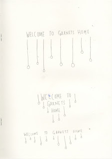
My friend's band called Garnets are creating their website and were looking for some artwork to include on their site and have looked at my blogged and liked some of my work! They liked the '
Hello There' bear that I illustrated for the Grizzly Bear series and are going to include it as a greeting as people scroll to the end of their website. (yey!) They also liked the watercolour mountains for their colour and simplicity as a possible image to use at the beginning of the website and I have been talking to them about doing some more original images for them. I chatted to my friend Sam in the band and discussed development from this starting point. The image for the start of the page must include the sentence
'Welcome To Garnet's Home' and include colour. Sam also mentioned that he liked the fact that the images didn't have a border, as the background of the website is white, this style would fit in with the website. He liked the type used for the
'Hello There' illustration.
Some scans of sketchbook pages with initial ideas and development. I want to edit the image and the text together and develop further, this is a starting point. I realize I can get quite obsessed with doing the same thing over and over again, I painted '
Welcome To Garnets' Home' a lot a lot of times!
Key Points to include/consider-
- Use of colour
- No border or bold edges
- Typography
- The style of their music, take influence when approaching work
- The layout of the site


No comments:
Post a Comment